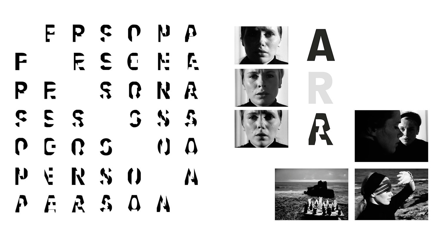
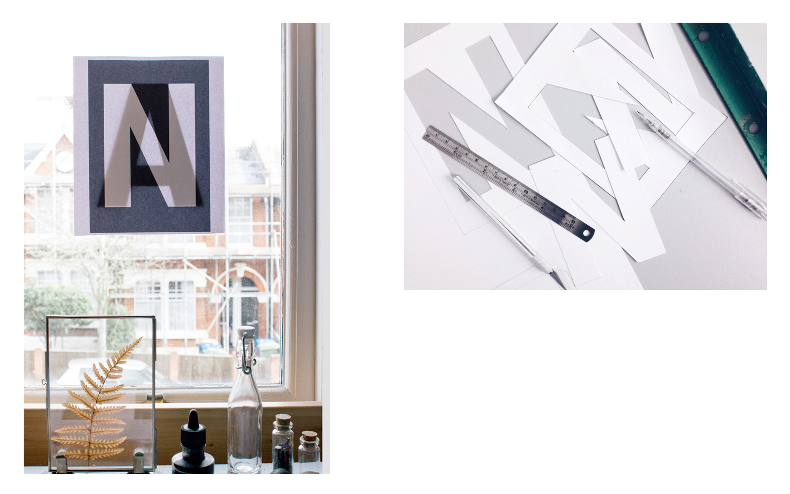
This typographic system was designed to promote a retrospective screening of three Ingmar Bergman films. Inspired by his cinematic techniques, it features overlain letterforms to visualise ambiguity and duplexity. The constructed typeface is comprised of algorithmically paired letters masked to create new forms, mirroring Bergman’s use of facial overlay and stark monochrome silhouettes.

The director’s own name has 5 of 8 total letters in common between first and last; perforated tickets are torn from A5 mailers, cropping combinations of N/ G / M / A / R as a homage to his notoriously close-up shots of human faces.


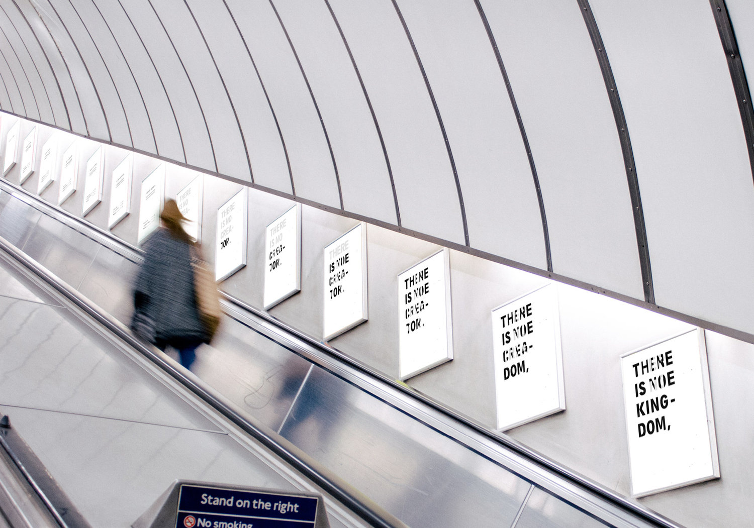
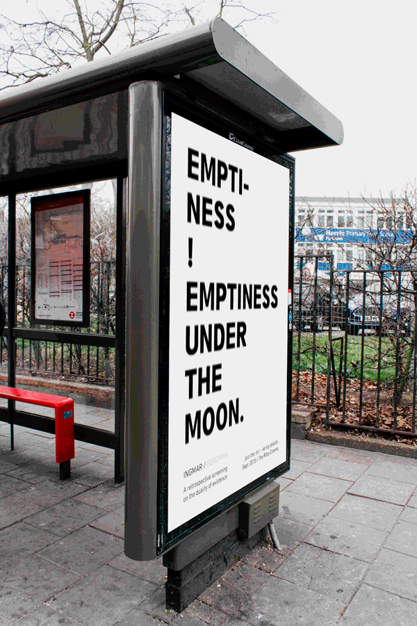
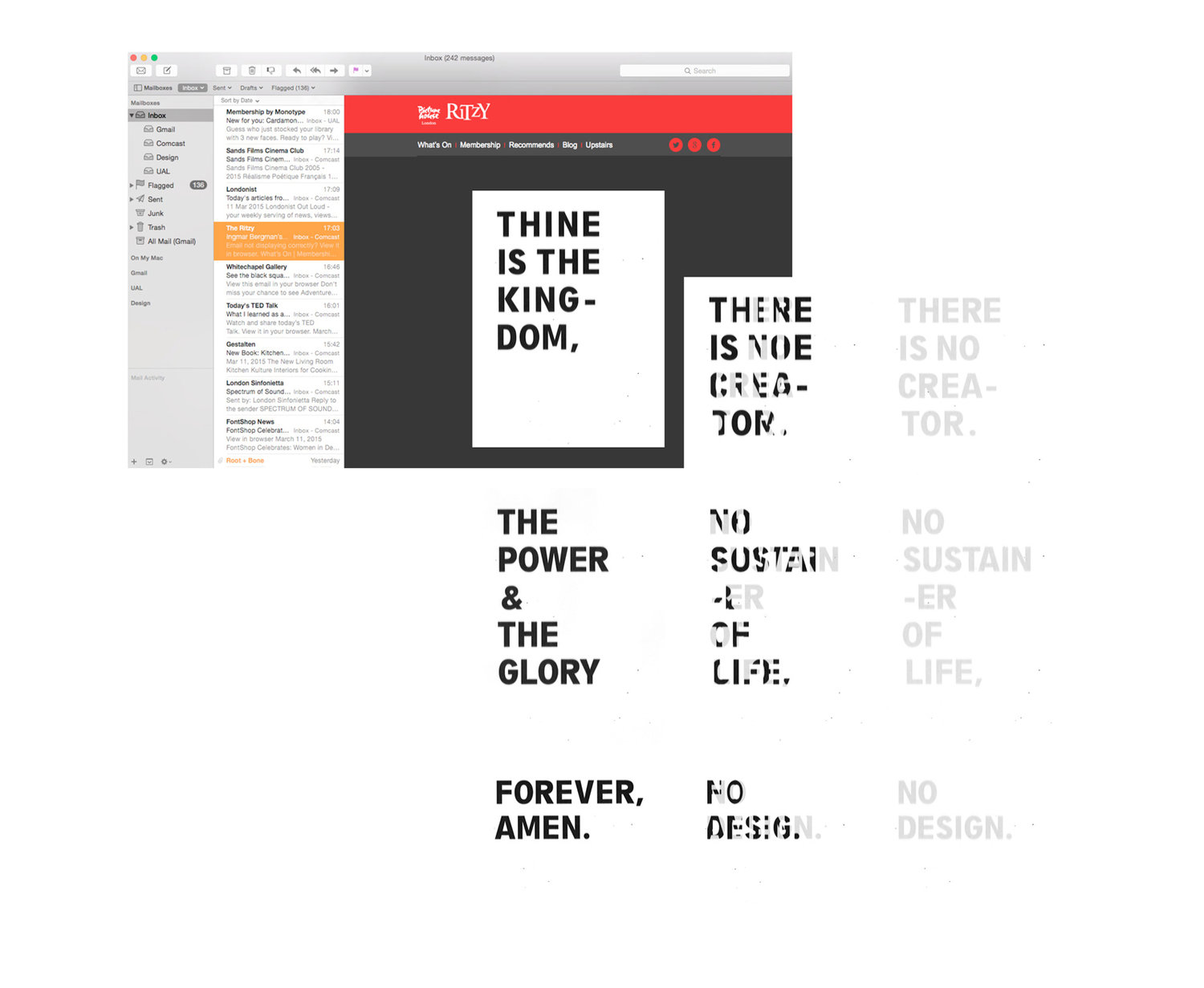
Screenplay excerpts, epitomising the duality of Bergman’s existential discourse, are juxtaposed with lenticular printing techniques. As viewing angle shifts, the message morphs into its contradicting counterpart. Seen straight-on, letterforms echo the poster typeface and screening details are fully revealed.